Aetna Member Value Statement: A streamlined member benefits portal
Members struggled to quickly access key information within their complex insurance portal. They were overwhelmed by the volume of content and couldn't easily find their account status, understand their health progress, or see the value of their membership.
We addressed this challenge by designing a streamlined experience focused on quick scanning and personalized insights. We prioritized key financial data (deductible progress, out-of-pocket costs), personalized health recommendations (including completed and recommended preventative care), and a clear display of member savings. Our goal was to create a scannable experience that prioritized key information: financial data (deductible progress, out-of-pocket costs), personalized health recommendations, and member savings.
I played a key role in the redesign, collaborating closely with my content strategist partner, business partners, and front-end developers. My contributions included initial strategy and concept development, low-fidelity A/B user testing, content mapping, and prototype development. The result was a streamlined portal that empowers members to quickly understand their account status, track their health journey, and see the value of their Aetna membership.
While working at Primacy, I helped conceptualize and design the UX flow and UI for a Gear VR platform featuring immersive stories and the ability to donate directly through the interface to worldwide charities. Below is a series of videos showing the UI and interaction states of the UI, as well as the account management UI set. It's a little hard to envision a VR experience in screenshot test videos, but these represent work that was in progress at the time.
Rose-Hulman Institute of Technology Website Redesign: Engaging the Next Generation of STEM Innovators
Project Overview: Rose-Hulman Institute of Technology, renowned for its unique and supportive environment for exceptionally creative STEM students, sought to revitalize its online presence to effectively attract and recruit prospective students. The goal was to develop a website experience that authentically showcased the institute's distinct advantages, emphasizing hands-on learning, personalized attention, and the transformative impact of a Rose-Hulman education.
My Role:
As the UX Lead for this critical initiative, I spearheaded the development of a comprehensive digital strategy and a series of innovative design concepts centered around key university pillars. My focus was on crafting a compelling user experience that would resonate with prospective students and effectively communicate the value proposition of a Rose-Hulman education. This involved:
Strategic UX Planning: I defined the user journey for prospective students, identifying key touchpoints and information needs throughout the recruitment process. This included conducting user interviews, competitive analysis and stakeholder discovery sessions to understand the motivations, aspirations, and online behaviors of the target demographic. This research informed the development of user personas and a detailed sitemap to ensure a user-centered approach.
Concept Development & Prototyping: I led the design and development of multiple UX concepts, each exploring different approaches to showcasing the Rose-Hulman experience. These concepts included:
Authentic Storytelling: Leveraging real-life student and alumni stories and testimonials to provide genuine insights into the Rose-Hulman experience and its impact on career trajectories. I defined the narrative framework and information architecture for these stories, ensuring they were easily discoverable and engaging.
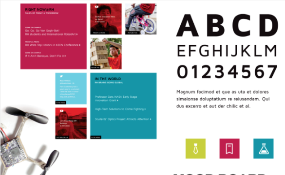
Dynamic Content Aggregation: Exploring the use of social media feeds and other dynamic content to showcase the vibrant campus life, student activities, and cutting-edge research happening at Rose-Hulman. I focused on curating and presenting this content in a way that was relevant and appealing to prospective students.
Outcome-Focused Design: Developing interactive experiences that highlighted the long-term benefits and career success of Rose-Hulman alumni, demonstrating the return on investment of a Rose-Hulman education. This involved [mention specific deliverables, e.g., wireframes, user flows, interactive prototypes].
Collaboration & Iteration: I collaborated closely with a visual design team to ensure that the interface design concepts were not only visually appealing and aligned with the pre-college demographic's aesthetic preferences, but also seamlessly integrated with the defined UX strategy. I facilitated regular design reviews and incorporated user feedback to iteratively refine the design concepts and ensure a cohesive and impactful user experience.
Stakeholder Management: I effectively communicated the UX strategy and design rationale to key stakeholders, including university leadership and marketing teams. I addressed their feedback and ensured alignment throughout the project lifecycle.
For Regis University's adult-learner audience, the key differentiator and brand message, "Look outward, inquire within" is focused on their Jesuit-based educational approach, which is all about helping you become the best version of yourself, so you can better help the world. This core message was carried through all the work. I was the creative lead on all of their program/degree specific ad campaigns and interactive experiences.
Emmanuel College had undergone a new brand identity development for attracting prospective students and update their existing website structure and CMS without an entire overhaul. My team worked with their existing internal development staff to develop a new website UX strategy, streamlining their navigation and top level structure, while infusing the new visual identity throughout the design.
For almost a year, I worked with the creative team at GPJ as a supporting Art Director/Designer for their experiential events marketing projects. I worked on a range of initiatives, supporting the teams for IBM. This covered a span of media from event guidance documentation, signage/structures, print, UI, and even global company collateral.
While working as a Sr UX lead with Sapient at Goldman Sachs in the Private Wealth Management division, their financial management portal UI and visual design had undergone an lengthy, iterative development without a lot of structure or guidance in the way it was presented. It was overly complicated in how the design & UI was developed, and while technically on-brand, it lacked a modern and sophisticated style and presentation. I was tasked to lead working with the Goldman internal experience and development teams to update the component library, and work with the development team to migrate the style library from conception to code.