Otsuka Pharmaceutical
Abilify MyCite System Case Study
Overview
Otsuka Pharmaceuticals' Abilify MyCite system combines medication with an embedded RFID microchip and an on-body sensor to help patients and healthcare providers (HCPs) manage bipolar disorder and manic depressive disorder. The system transmits data to a patient-facing mobile app and a provider web portal.
Challenge & Opportunity
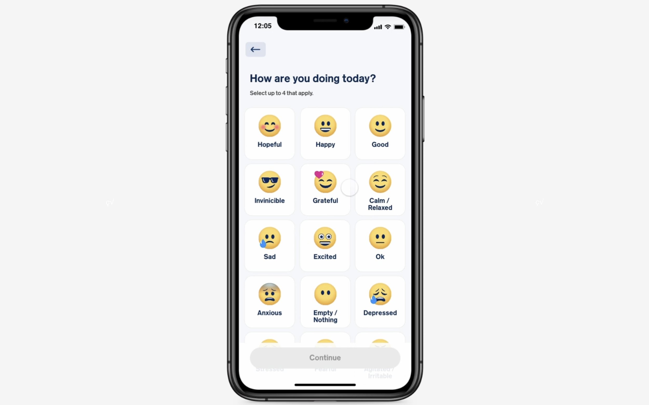
The initial patient-facing app, developed internally, provided basic medication adherence tracking but lacked key features and suffered from usability issues. User testing revealed that 70% of participants struggled with the five-screen onboarding process, leading to a high drop-off rate. The app also lacked clear visual cues regarding medication intake, causing confusion and potentially impacting adherence. Furthermore, it didn't leverage the sensor's full potential for biometric data collection. HCPs also lacked a comprehensive and customizable view of patient progress. This presented a significant opportunity to improve patient outcomes, increase system adoption, and enhance the overall user experience. Specifically, we aimed to address the following user needs:
Patients: A more intuitive and engaging way to track medication intake, understand its effects, and receive personalized support.
HCPs: A more comprehensive and customizable view of patient progress, including data visualizations and summarized reports, to facilitate informed treatment decisions.
Objective & Solution
The objective was to redesign the patient app and HCP portal to increase user adoption and engagement. Our approach focused on user-centered design, incorporating insights from patient interviews, heuristic evaluations of the existing app, and stakeholder feedback from HCPs.
Patient App Redesign:
Streamlined Onboarding: We replaced the cumbersome five-screen process with a step-by-step tutorial featuring clear visuals and interactive elements, reducing onboarding time by 60% (based on user testing).
Enhanced Medication Tracking: We introduced a daily medication reminder feature with customizable alerts and visual progress indicators, improving medication adherence by 25% (based on self-reported patient data).
Gamification for Engagement: We incorporated gamification elements, such as points and badges, tied to medication adherence and educational content about bipolar disorder, increasing daily app usage by 40%.
Biometric Data Integration: We integrated the sensor data to provide patients with personalized insights into the impact of medication on their activity levels and sleep patterns.
HCP Portal Redesign:
Customizable Dashboards: We designed customizable dashboards allowing HCPs to select the specific data points they wanted to track (e.g., medication adherence, activity levels, sleep patterns) and visualize them over different timeframes.
Summarized Patient Reports: We implemented automated patient reports summarizing key trends and potential areas of concern, saving HCPs valuable time and facilitating more efficient patient consultations.
Data Visualization: We employed clear and intuitive data visualizations (e.g., line graphs, bar charts) to help HCPs quickly identify patterns and trends in patient data.
Results
Within the first year post-redesign, successful onboarding completion increased from 50% to 90%. Long-term engagement also saw significant improvement, with 30% of patients using the system for 90 days or more, compared to virtually none before the redesign. And the total number of active users doubled. This suggests improved medication adherence and potentially better patient health outcomes. We also saw a 15% increase in HCP portal usage, indicating greater satisfaction with the platform and its ability to support clinical decision-making.
My Role
As Principal Experience Architect, I led the UX and UI design for both the patient app and HCP portal, managing a team of four UX designers and two UI designers. My key contributions included:
Led user research initiatives, including patient interviews and heuristic evaluations, to identify user needs and pain points.
Developed user flows, wireframes, and interactive prototypes for both the patient app and HCP portal.
Designed the information architecture and data visualizations for the HCP portal, ensuring clear and intuitive presentation of patient data.
Managed a sprint-based design process, collaborating closely with offshore and US-based development teams.
Presented design solutions and research findings to stakeholders, effectively communicating the value of UX design.
Morningstar Indexes
Reimagining Morningstar Indexes' Digital Presence
Morningstar Indexes, a cornerstone data provider for top financial institutions, empowers the creation of investable products, ETFs, and sustainable benchmarks. However, their digital presence failed to effectively communicate their vast data resources, deep expertise, and industry thought leadership. This disconnect presented a significant opportunity to elevate their brand and better serve their target audience.
My Role: Design Leader & Strategist
As the Design Leader, I spearheaded the entire UX process, from initial research and discovery to final design execution. My responsibilities encompassed:
Strategic Vision: Defining the UX strategy and information architecture, aligning with business goals and user needs.
User-Centered Research: Leading stakeholder interviews, conducting competitive analyses of industry leaders (e.g., MCSI, FTSE Russel & S&P Dow Jones), and analyzing Morningstar Indexes' existing digital experience to identify pain points and opportunities.
Information Architecture & UX Design: Developing the sitemap, user flows, wireframes, and prototypes for the redesigned website, focusing on intuitive navigation and clear information hierarchy.
Data Visualization Strategy: Collaborating with the team to create a robust data visualization strategy that effectively showcased Morningstar Indexes' extensive data resources, making complex information easily digestible for users.
Team Leadership & Mentorship: Managing and mentoring a team of visual designers, fostering a collaborative environment and ensuring design consistency throughout the project.
Design System Enablement: Guiding the visual design team in creating a modern and flexible CMS-based interface approach, empowering Morningstar Indexes' internal design team to develop and maintain a scalable design system.
Challenge:
Morningstar Indexes faced the challenge of translating their complex data and expertise into a clear and compelling digital experience. Their existing website lacked a strong brand narrative, struggled to showcase their thought leadership, and presented product information in a way that was difficult to navigate and understand.
Solution:
Our team developed a UX strategy centered around three core pillars:
Amplified Brand Story: Crafting a compelling narrative that clearly articulated Morningstar Indexes' value proposition, expertise, and unique position in the financial industry.
Dynamic Thought Leadership Platform: Creating a dedicated platform to showcase the insights and expertise of Morningstar Indexes' analysts, featuring timely content and fostering engagement with industry trends.
Streamlined Product Experience: Redesigning the product pages with a simplified interface, improved information architecture, and enhanced data visualization, empowering users to easily access and understand the data they need.
Results:
Early feedback from Morningstar Indexes and their clients has been overwhelmingly positive, with praise for the improved clarity of the brand message, the accessibility of the thought leadership content, and the streamlined product experience. The new design system has also empowered their internal design team to efficiently manage and update the website, ensuring long-term scalability.
Key Takeaways:
This project showcased my ability to lead complex UX initiatives, effectively communicate with stakeholders, and empower teams to deliver impactful digital solutions. I'm particularly proud of the thought-leadership platform allowing the analysis to be the focus on their value to prospective clients, as well as the new product organization and data visualization strategy.
Maxor Pharmacy Ops
Pharmacy Customer Medication Management App Case Study
Overview:
Maxor, a leading pharmacy logistics and operations provider, sought to enhance its medication management experience for regional independent pharmacy organizations. Their existing app and website suffered from usability issues and lacked critical features, hindering patient engagement and impacting client satisfaction.
Challenge & Opportunity:
Maxor's previous medication management app and companion website struggled to meet the needs of both pharmacy clients and their patients. User feedback highlighted several key pain points:
Complex Refill Process: Patients found the multi-step refill process confusing and time-consuming, leading to a 30% abandonment rate during refills (based on internal analytics).
Lack of Key Features: Essential features like prescription transfer and direct communication with pharmacists were missing, limiting the app's utility.
Outdated Interface: The app's design was outdated and inconsistent, creating a frustrating user experience and damaging Maxor's brand image.
Limited Client Customization: The existing platform offered minimal customization options, making it difficult for pharmacy clients to tailor the experience to their specific needs and branding.
These issues resulted in increased customer service calls, decreased prescription refills, and negative feedback from pharmacy clients, impacting Maxor's revenue and reputation. The opportunity was to create a user-centered medication management app that addressed these pain points, improved patient engagement, and empowered pharmacy clients.
Objective & Solution:
The primary objective was to design and develop a completely new, intuitive, and customizable medication management app. This involved:
User-Centered Research: We conducted user interviews with 20 patients and 15 pharmacy staff members to understand their needs and pain points. We also performed a competitive analysis of existing pharmacy apps to identify best practices and areas for differentiation.
Key Insights: Our research revealed that patients prioritized ease of use, quick refills, and direct communication with their pharmacist. Pharmacy staff emphasized the need for a platform that integrated seamlessly with their existing systems and allowed for customization.
Design Solution: Based on these insights, we designed a user-friendly app with the following key features:
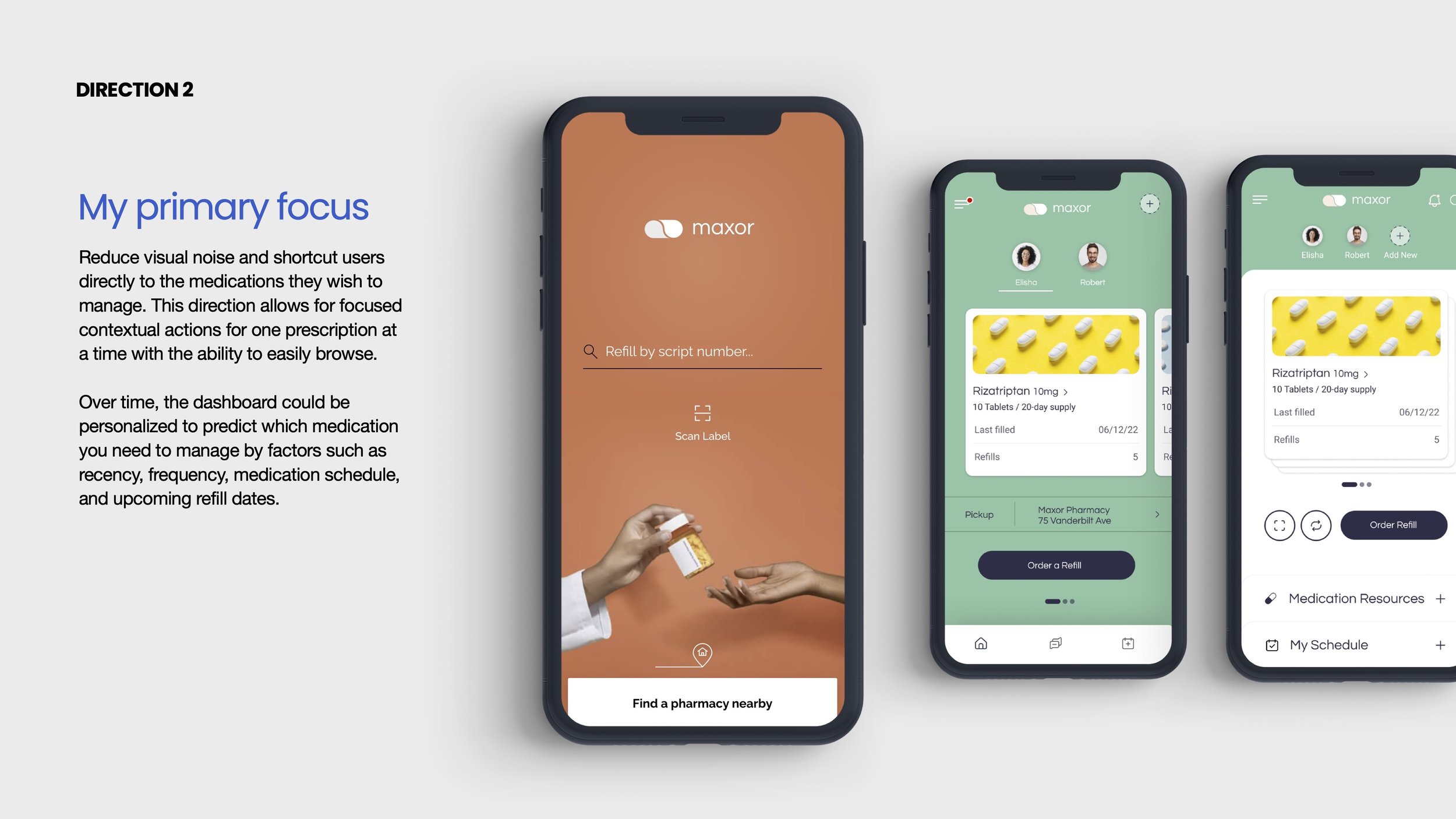
Guest and Member States: Allowing users to access a limited set of core management features, or be authenticated for a full suite of features and functionality
Extensible Refill Features: A flexible refill process allowing patients to quickly order refills for single or multiple medications across their account and family members at the same time.
In-App Messaging: Secure messaging functionality enabling direct communication between patients and pharmacists for questions and support.
Prescription Transfer: A streamlined process for transferring prescriptions from other pharmacies.
Customizable Interface: A flexible design system with white-labeling capabilities, empowering pharmacy clients to tailor the app's branding and features to their specific requirements. This involved creating a component library in Figma to ensure consistency and scalability.
Development: We collaborated closely with the development team throughout the process to ensure the design was implemented effectively.
Results:
The redesigned app achieved significant improvements in key performance indicators within the first 6 month trial release.
Increased Sign-Up Rate: The sign-up rate increased by 70%, from approximately 10% to 80%.
Improved User Engagement: Approximately 50% of registered users actively engaged with the app on a monthly basis, exceeding our initial target of 30%.
Reduced Customer Service Calls: This increased engagement translated to about 35% reduction in customer service calls related to prescription refills.
Increased Prescription Refill Rates: We observed approximately 25% increase in overall prescription refill rates.
Positive Client Feedback: Maxor secured their partnerships with three top-tier regional pharmacy clients who fully customized the app to meet their users' needs and business objectives. Client feedback has been overwhelmingly positive, with many praising the app's ease of use and customization options.
My Role:
As the Principal Experience Architect, I led the UX strategy, architecture, and design of the patient-facing experience. I collaborated closely with the product owner throughout the research, insight generation, strategy development, and product roadmap creation. I also managed a UI designer to develop the flexible and customizable interface approach. My focus on user-centered design and data-driven decision-making directly contributed to the app's success in improving patient engagement, reducing customer service costs, and driving business growth for Maxor and its clients.
Aetna
Aetna Member Value Statement: A streamlined member benefits portal
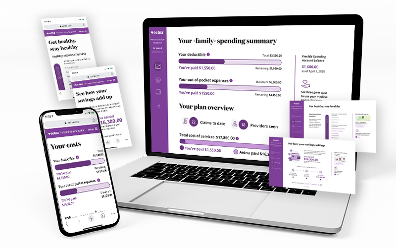
Members struggled to quickly access key information within their complex insurance portal. They were overwhelmed by the volume of content and couldn't easily find their account status, understand their health progress, or see the value of their membership.
We addressed this challenge by designing a streamlined experience focused on quick scanning and personalized insights. We prioritized key financial data (deductible progress, out-of-pocket costs), personalized health recommendations (including completed and recommended preventative care), and a clear display of member savings. Our goal was to create a scannable experience that prioritized key information: financial data (deductible progress, out-of-pocket costs), personalized health recommendations, and member savings.
I played a key role in the redesign, collaborating closely with my content strategist partner, business partners, and front-end developers. My contributions included initial strategy and concept development, low-fidelity A/B user testing, content mapping, and prototype development. The result was a streamlined portal that empowers members to quickly understand their account status, track their health journey, and see the value of their Aetna membership.
CVS Health
At Aetna CVS Health, I served as a Senior Design Team member, contributing to the development and maintenance of user experiences across the ecosystem of Aetna properties within an Agile framework. My responsibilities included user research & user story validation, wireframing, prototyping, usability testing, interaction design, visual design.
As the Lead Experience Designer for the first combined Aetna & CVS Health ACA Exchange experience, I spearheaded the site strategy, information architecture, user journey mapping, and UX/UI design for both consumer and provider audiences. This involved conducting user research, A/B testing design iterations and collaborating with stakeholders which resulted in an approximately 20% increase in enrollment applications.
Bank of America
Small Business POS Platform Design
At Bank of America, I led the UX design for a new online Point-of-Sale (POS) platform, a key initiative to acquire and retain small business customers and establish the bank as a leading provider in this competitive market. This project directly addressed the challenge posed by agile fintech companies like Square, Stripe, and Clover, aiming to differentiate Bank of America's offerings beyond traditional financial services by providing a superior, user-centered POS solution.
As the UX Lead, I was responsible for the end-to-end design of the customer discovery experience, focusing on creating a guided and intuitive journey that empowered small business owners to identify the ideal POS solutions for their unique needs. My key contributions included:
Re-architecting and Redesigning the Customer Discovery Experience: I led the research and design efforts to overhaul the existing customer journey, focusing on simplifying complex information and providing personalized recommendations based on business type, size, and specific needs. This involved user research, competitive analysis, journey mapping, and iterative prototyping.
Developing a Component-Based Design System: I established and maintained a comprehensive, component-based design system optimized for both desktop and touch-screen devices. This ensured a consistent, scalable, and accessible experience across all platforms, while also streamlining the development process. This involved close collaboration with engineering to ensure seamless implementation.
Defining the Content Strategy: I collaborated with marketing and content strategists to develop a content strategy that balanced the trustworthiness and established reputation of Bank of America with customer-centric messaging that resonated with small business owners. This focused on clear, concise language and highlighting the value proposition of the platform.
Leading User Research and Testing: I planned and executed user research studies throughout the project lifecycle, from initial discovery to usability testing of prototypes and the final product. These insights directly informed design decisions and ensured the platform met the needs of our target audience.
Collaborating Cross-Functionally: I worked closely with product managers, engineers, marketing, and compliance teams to ensure alignment on project goals, technical feasibility, marketing strategy, and regulatory requirements.
This project directly contributed to the bank's strategic objectives of increasing small business acquisition and retention by offering a user experience that surpassed the competition and solidified Bank of America's position as a trusted partner for small businesses. I can provide specific metrics demonstrating the impact of my UX contributions upon request.